Interface style guide
The interface design prescribes one treatment for each component. There are 23 design tokens: 12 colour roles, five type steps, four spacing steps and two radii. The six liveness bindings are fixed semantics, including the empty running glyph. The only user-facing theme choice is Light / Dark / System. These are internal product constants, not user-editable tokens, presets or a custom-palette API.
Rules applied
Read the rule, then compare its light/dark web and TUI specimens with the current screen. The specimens consume the generated CSS. TUI examples show the prescribed cell layout and colours in HTML; they are not a running Bubble Tea app. Example controls are inert, except native disclosure menus. System selects one of these same two themes.
The web stills show the redesigned product after P2, recorded with the repository's container recorder. TUI stills are real app-model Update/View frames after P5, with deterministic fixtures in both themes; they are not live agent recordings. The TUI appearance gallery covers the complete matrix, including Light · Dark · System. Empty/error web specimens link to the P4 recovery matrix. Click a still for the full screen.
Rail
Use surface behind the rail, ink for names and ink-muted only for branch/time metadata. Selected rows use surface-raised plus an accent marker and bold name; the state keeps its own colour. Body type, space-2 row insets and space-1 glyph gaps are fixed. Show one label per liveness state; disclose mechanical detail on selection.
Web · Light
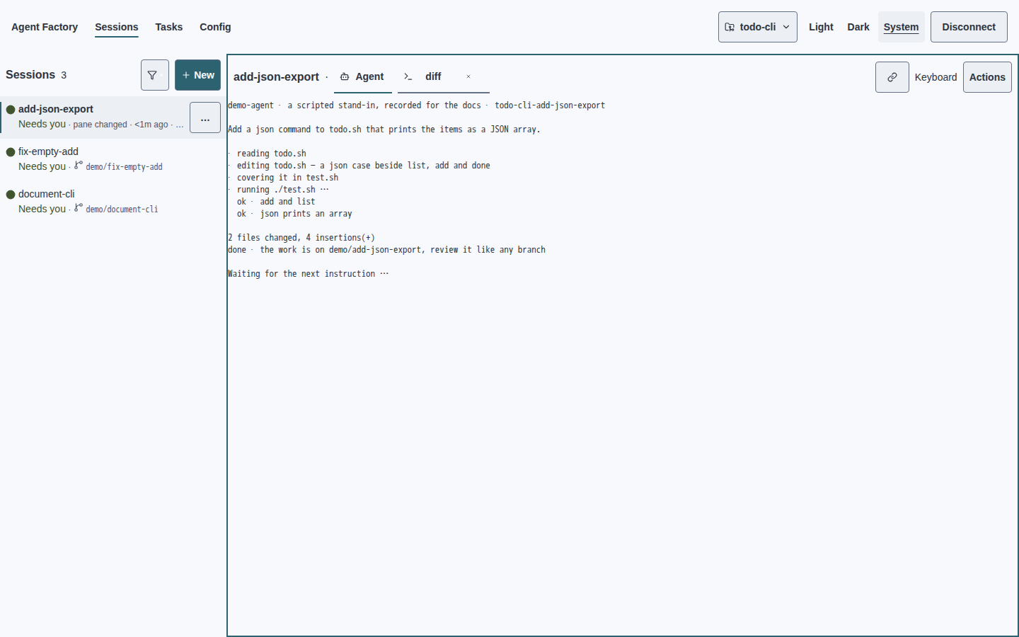
TUI · Light
    tidy-tests · Running
› ● add-json-export · Ready
  ◌ remote-build · Lost
  ○ fix-empty-add · Dead
  ▧ document-cli · Archived
  ◆ nightly-review · Limit reached
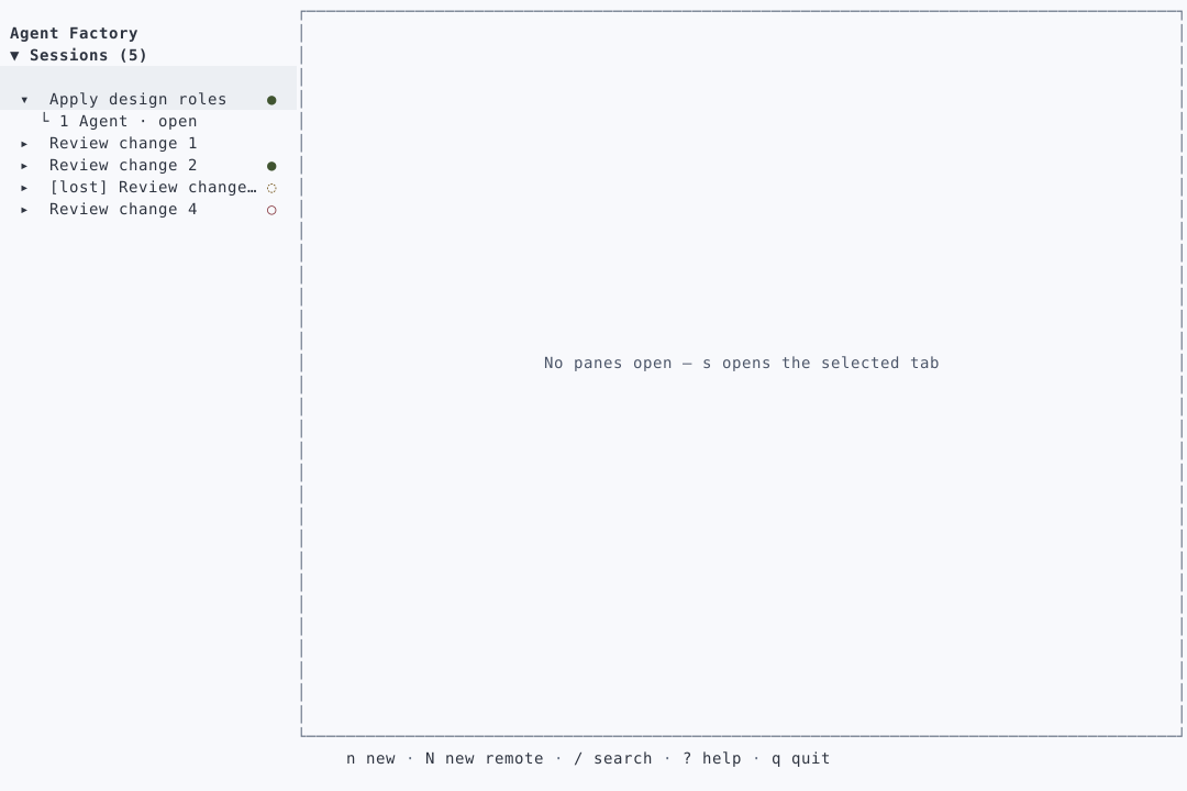
Web · Dark
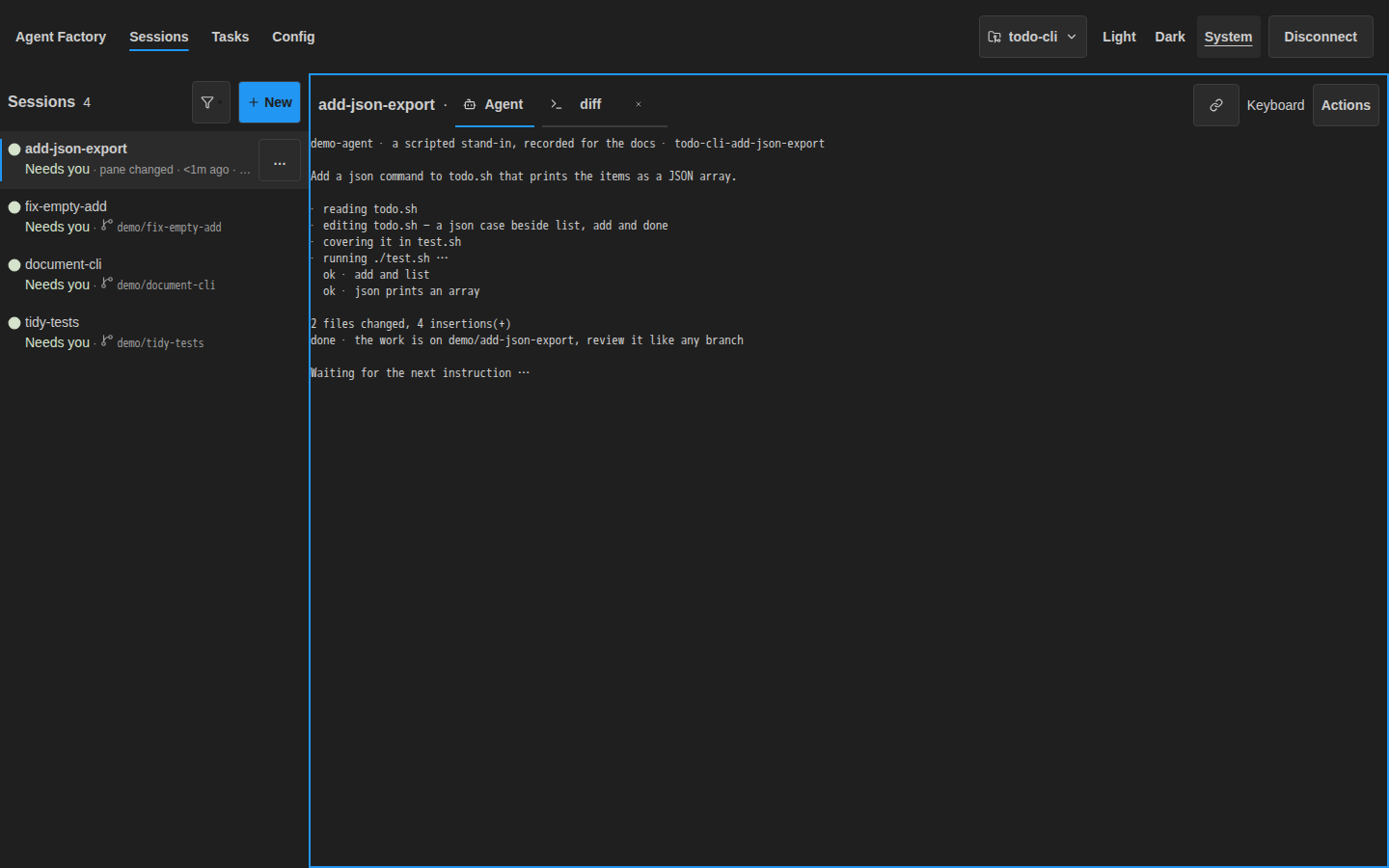
TUI · Dark
    tidy-tests · Running
› ● add-json-export · Ready
  ◌ remote-build · Lost
  ○ fix-empty-add · Dead
  ▧ document-cli · Archived
  ◆ nightly-review · Limit reached
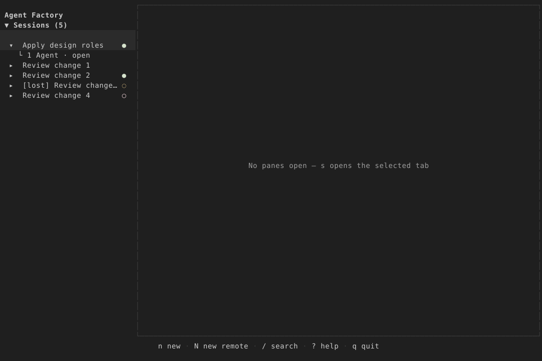
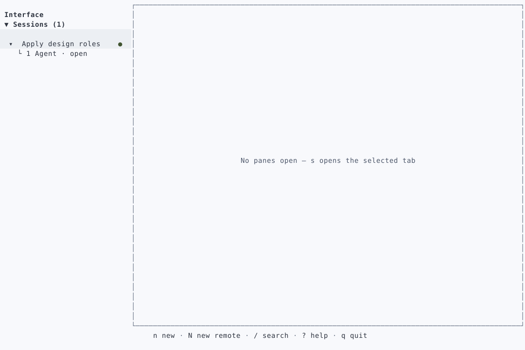
Header
Use surface with ink context and heading type; no raised toolbar. Mark the active view with an accent underline, and use ink-muted only for secondary connection detail. Use space-3 insets and space-2 between controls. Theme choice is exactly Light / Dark / System.
Web · Light
TUI · Light
todo-cli · Sessions · Connected
Keyboard: navigation
Web · Dark
TUI · Dark
todo-cli · Sessions · Connected
Keyboard: navigation
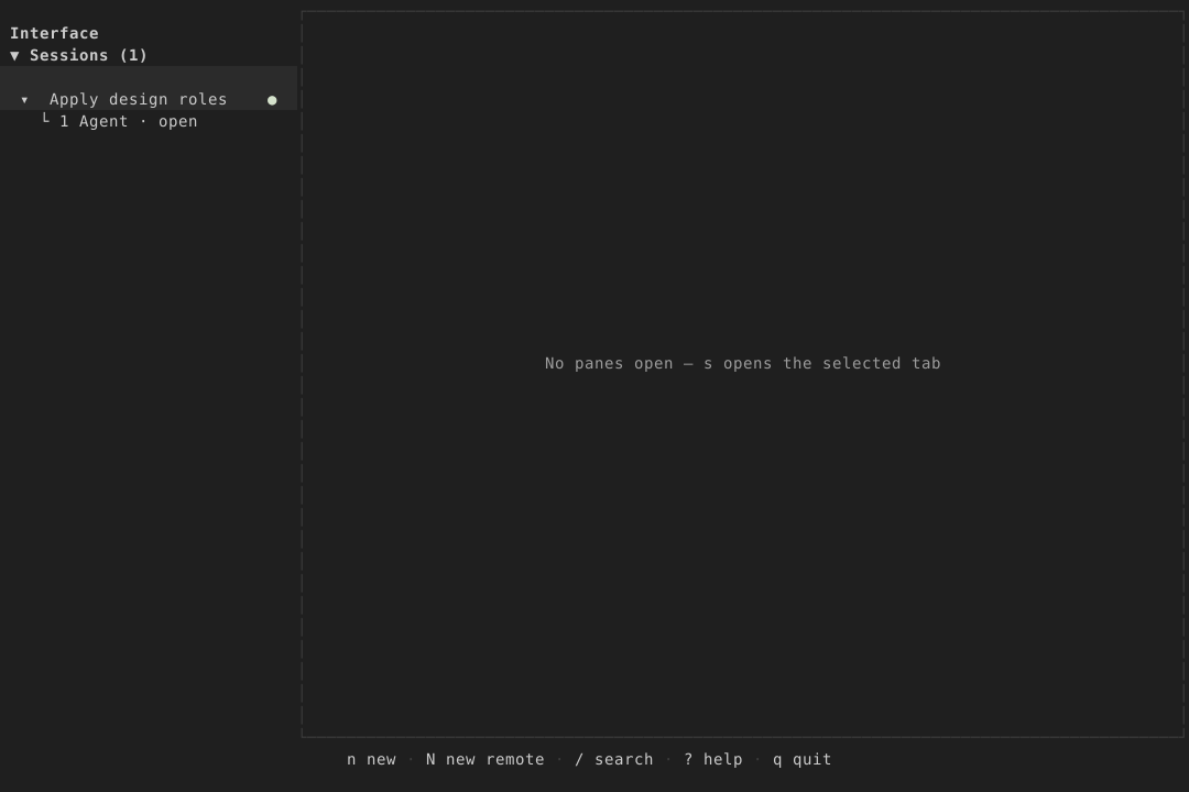
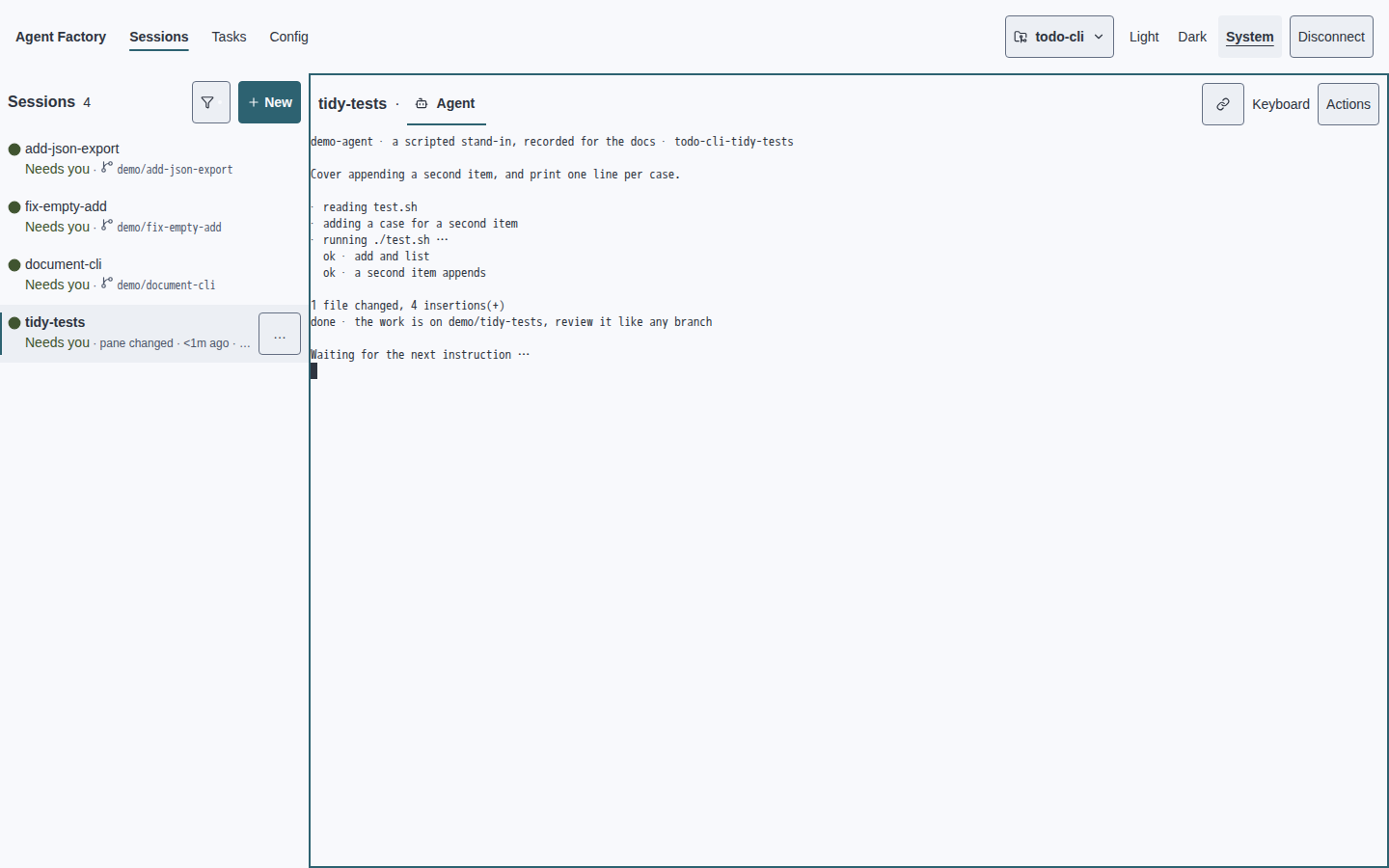
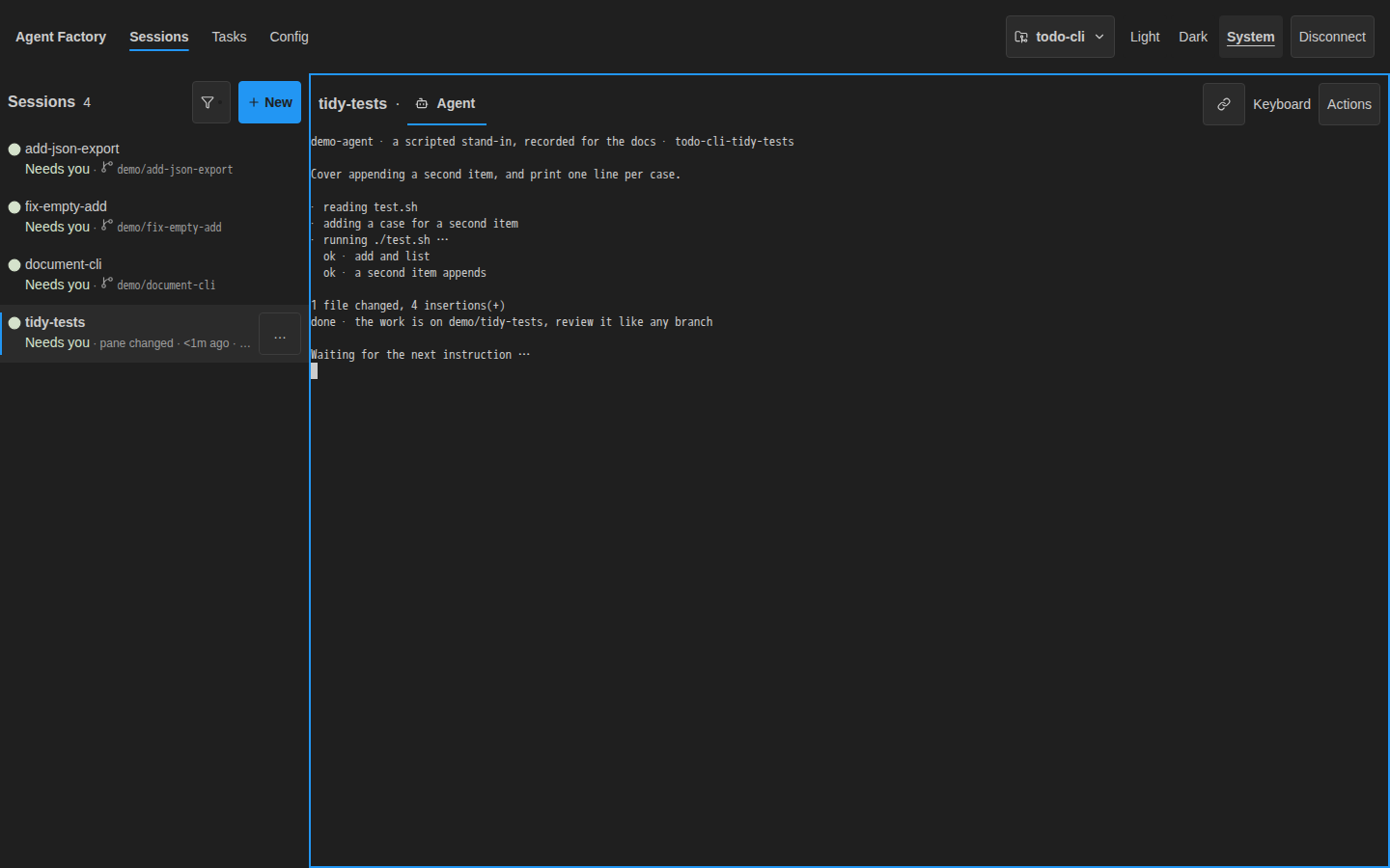
Terminal chrome
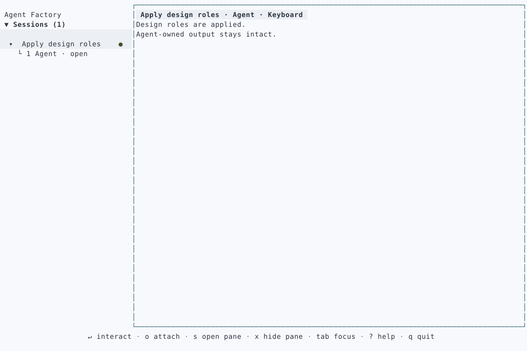
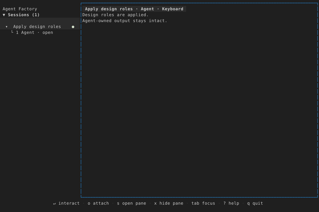
Use surface with ink title, heading type and border for an unfocused frame. Keyboard ownership adds the accent outline and the word Keyboard, never ready green. Use space-2 chrome insets; terminal content gets no decorative padding. Preserve agent ANSI output and ctrl+] exit.
Web · Light
$ ./test.sh
2 tests passed
ctrl+] · Return to sessions
TUI · Light
┌ tidy-tests · Agent · Keyboard ┐
│ $ ./test.sh                  │
│ 2 tests passed               │
└ ctrl+] · Return to sessions ─┘
Web · Dark
$ ./test.sh
2 tests passed
ctrl+] · Return to sessions
TUI · Dark
┌ tidy-tests · Agent · Keyboard ┐
│ $ ./test.sh                  │
│ 2 tests passed               │
└ ctrl+] · Return to sessions ─┘
Tabs and review
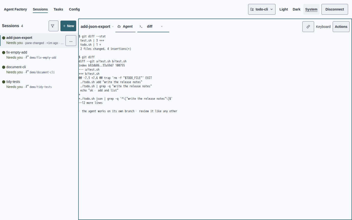
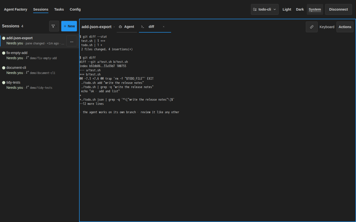
Use surface and body-sized ink labels. Only the active tab gets an accent underline and bold text. Review branch changes in a process tab beside the agent tab. Use space-2 between tabs, no pill radii. TUI selection is a raised row and cursor. Preserve keyboard routes to close, switch and split.
Web · Light
$ git diff --stat
2 files changed
TUI · Light
  1 · Agent
› 2 · diff
  2 files changed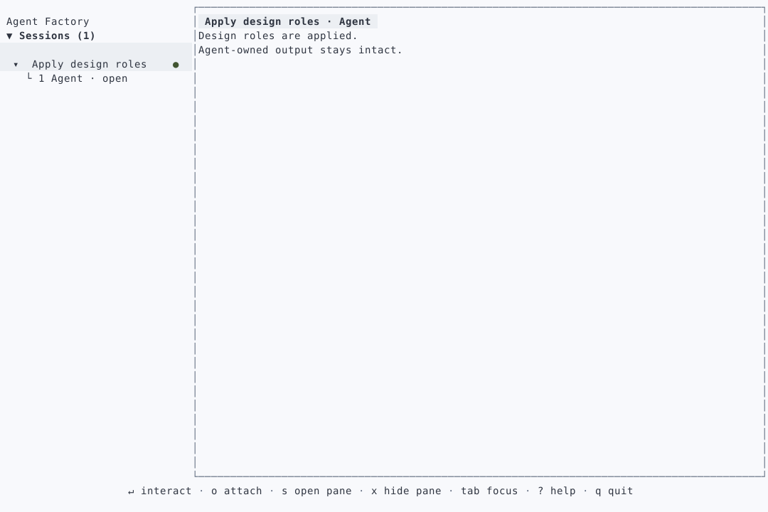
Web · Dark
$ git diff --stat
2 files changed
TUI · Dark
  1 · Agent
› 2 · diff
  2 files changed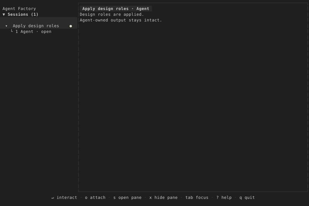
Dialogs and overlays
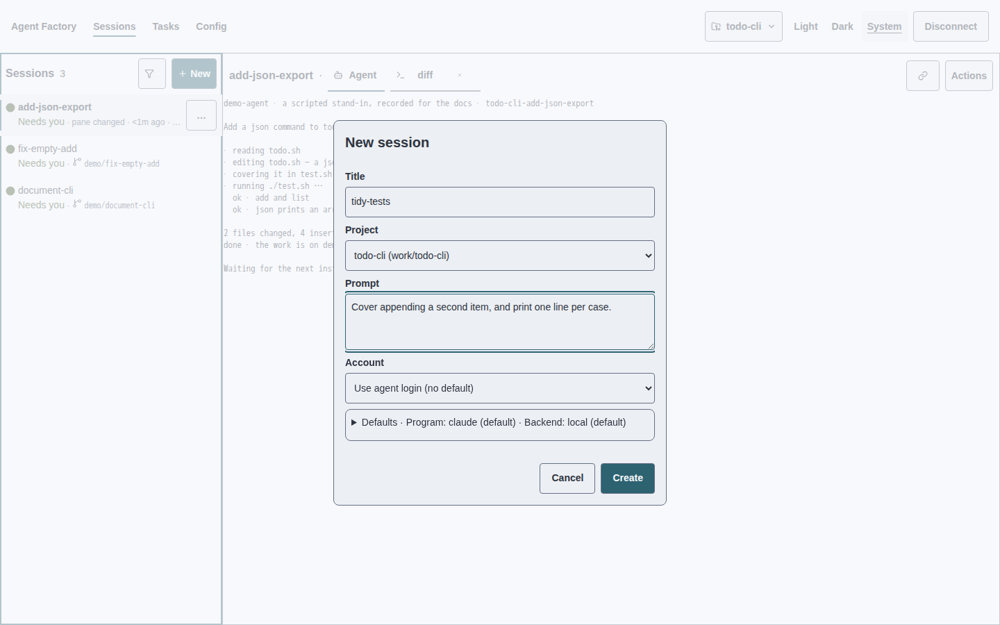
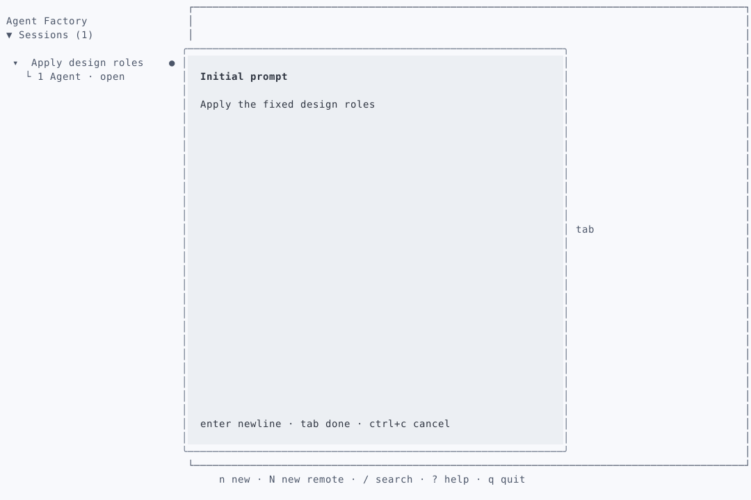
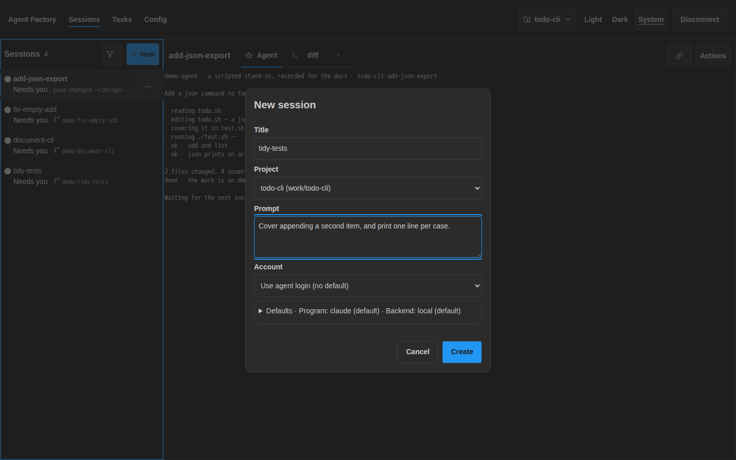
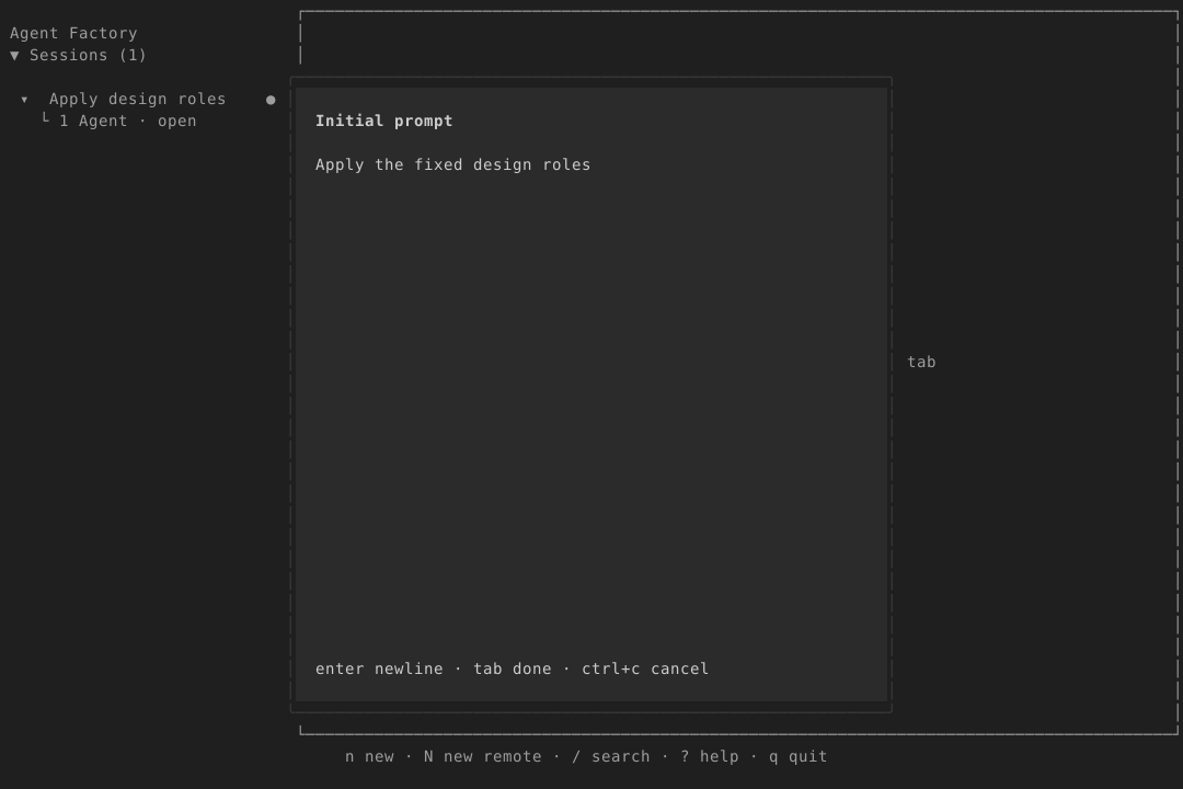
Use surface-raised, border and radius-dialog with space-3 insets. The title uses type-title; body and field labels use ink at body size. Group fields with space-2 and separate the footer with space-4. One accent-filled primary button; inline failure uses dead. Preserve input and restore focus on close.
Web · Light
TUI · Light
╭ New session ───────────────╮
│ Title: tidy-tests          │
│ Prompt: Cover appending…   │
│ enter create · esc cancel  │
╰───────────────────────────╯
Web · Dark
TUI · Dark
╭ New session ───────────────╮
│ Title: tidy-tests          │
│ Prompt: Cover appending…   │
│ enter create · esc cancel  │
╰───────────────────────────╯
Tasks
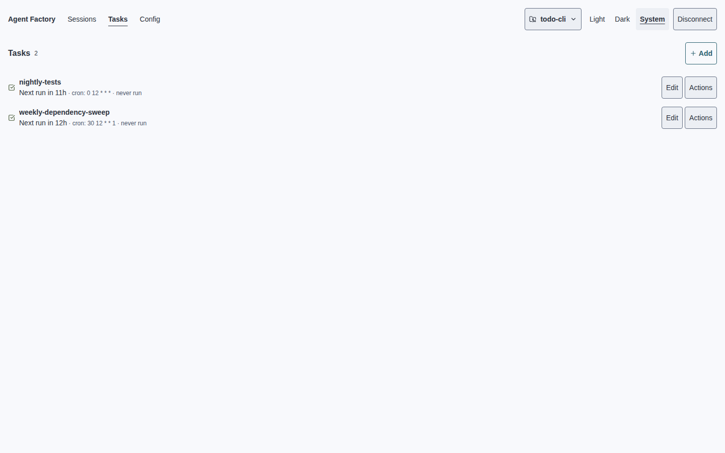
Use surface; task names, next run and action labels use body-sized ink. Only raw trigger/time metadata uses caption-sized ink-muted. Selected tasks use surface-raised plus the accent marker. Use space-2 row insets, space-4 between groups. Failures use dead and stay visible. Edit is primary; other actions are disclosed.
Web · Light
Next run · Tomorrow at 12:00 UTC
cron · 0 12 * * *
TUI · Light
Tasks
› nightly-tests · Enabled
  Next run · Tomorrow at 12:00 UTC
  enter edit · r run now · esc back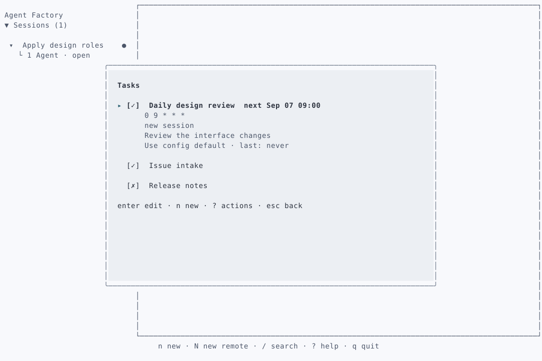
Web · Dark
Next run · Tomorrow at 12:00 UTC
cron · 0 12 * * *
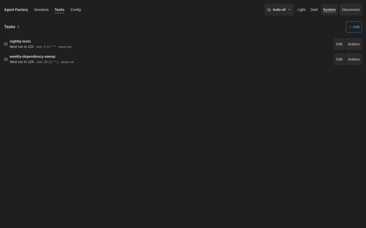
TUI · Dark
Tasks
› nightly-tests · Enabled
  Next run · Tomorrow at 12:00 UTC
  enter edit · r run now · esc back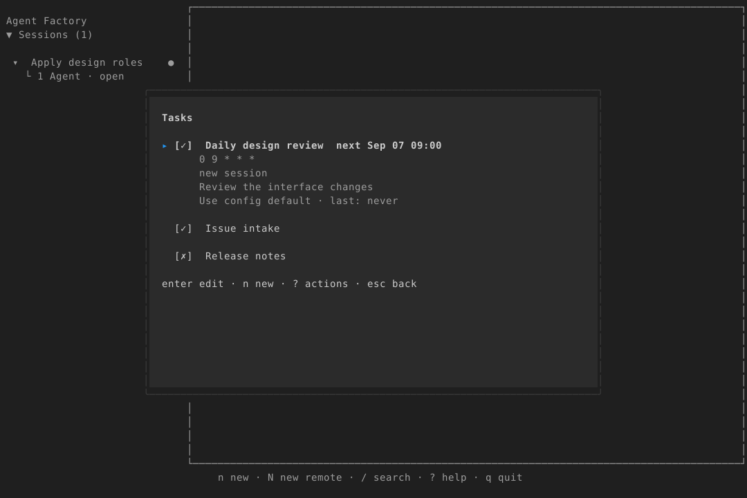
Config and accounts
Use surface with heading-sized ink section titles, body-sized ink keys, labels and values, and caption-sized ink-muted paths. Inputs use surface-raised, border and radius-control. Use space-3 panel insets and space-4 between Config and Accounts. Appearance offers Light / Dark / System only. No palette editor, presets or colour keys.
Web · Light
Config · Local daemon/work/config.tomlSaved · Applies to new tabs
Accounts
work · Logged in
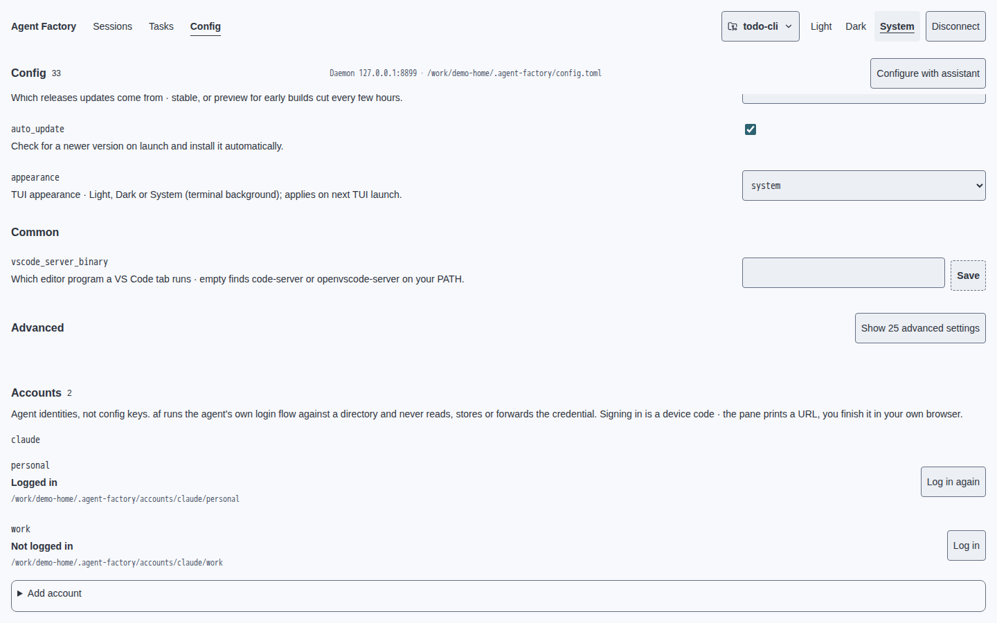
TUI · Light
Config · Local daemon
  Appearance: System · Light · Dark
› Editor binary: code-server
  Saved · Applies to new tabs
Accounts
  work · Logged in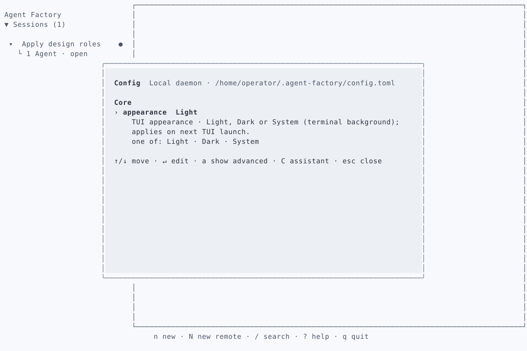
Web · Dark
Config · Local daemon/work/config.tomlSaved · Applies to new tabs
Accounts
work · Logged in
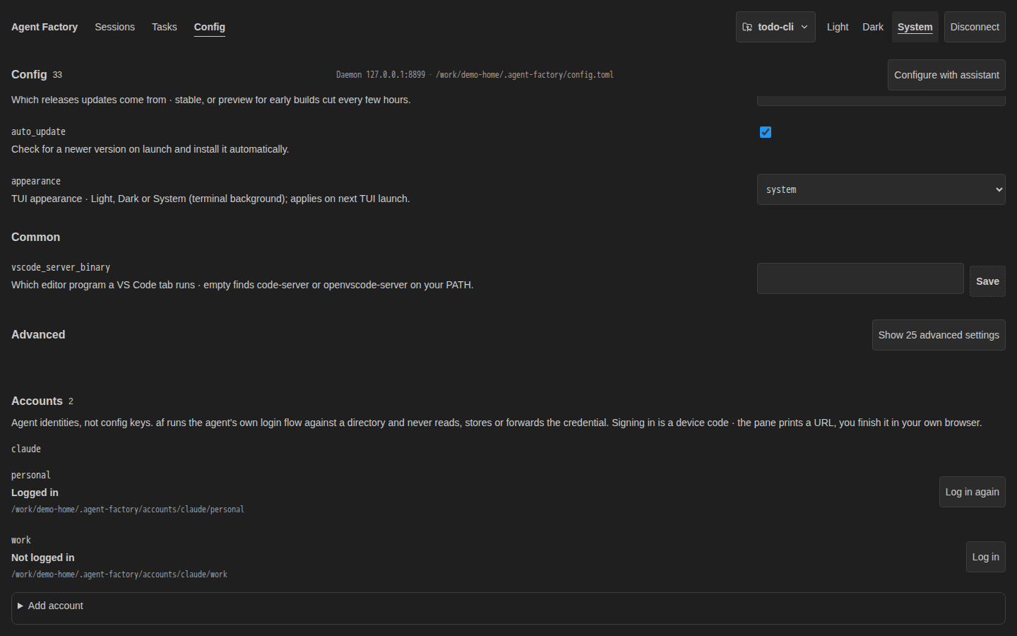
TUI · Dark
Config · Local daemon
  Appearance: System · Light · Dark
› Editor binary: code-server
  Saved · Applies to new tabs
Accounts
  work · Logged in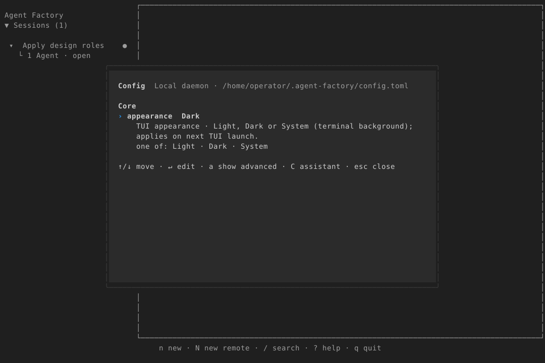
Buttons, fields and menus
Primary: accent fill with surface text. Secondary: surface-raised fill with ink text. All controls use border, body type, radius-control and space-2 padding; focus always adds the accent outline. Disabled controls keep ink and a dashed outline. Destructive confirmation uses dead text. Menus use surface-raised and radius-dialog. Never use ink-muted for action or field labels.
Web · Light
Project · todo-cli
todo-cli · Selected
Register project…
TUI · Light
Project
› todo-cli · Selected
  Register project…
enter select · esc cancel
Creating… · Please wait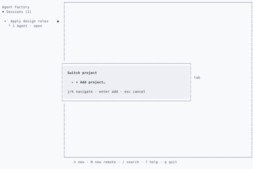
Web · Dark
Project · todo-cli
todo-cli · Selected
Register project…
TUI · Dark
Project
› todo-cli · Selected
  Register project…
enter select · esc cancel
Creating… · Please wait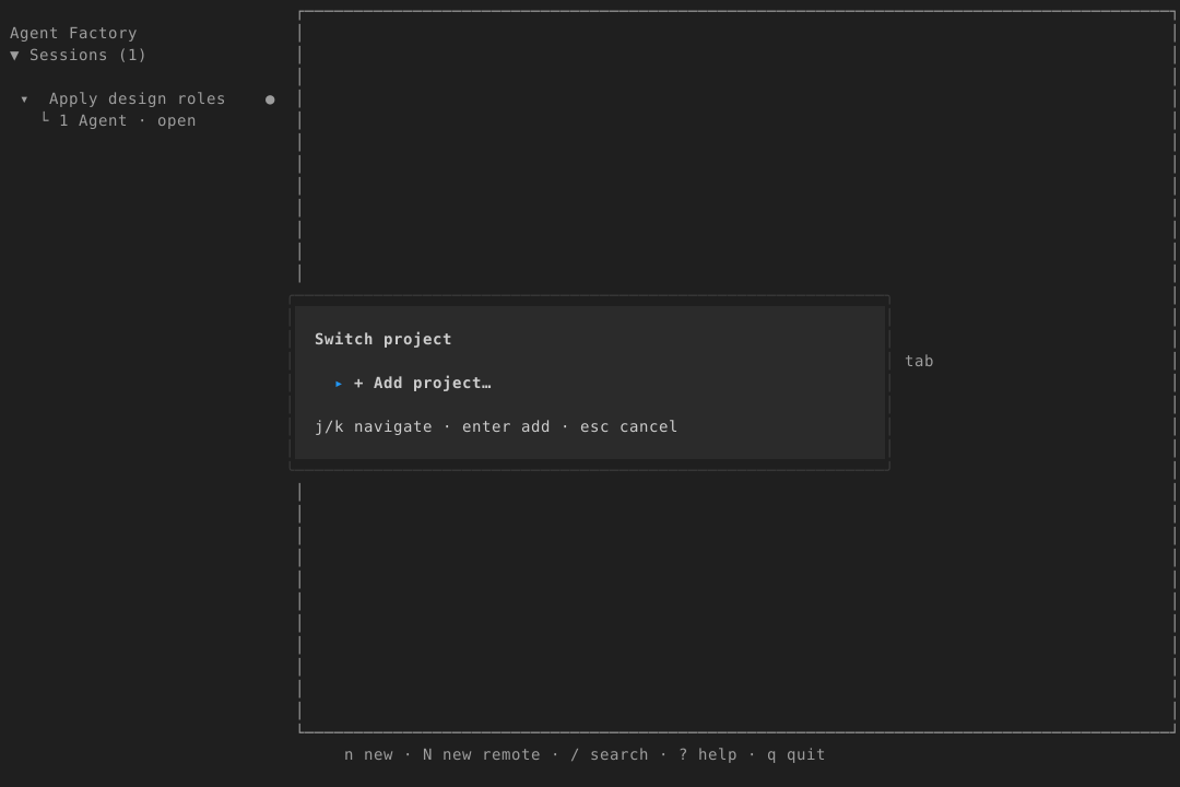
Empty states
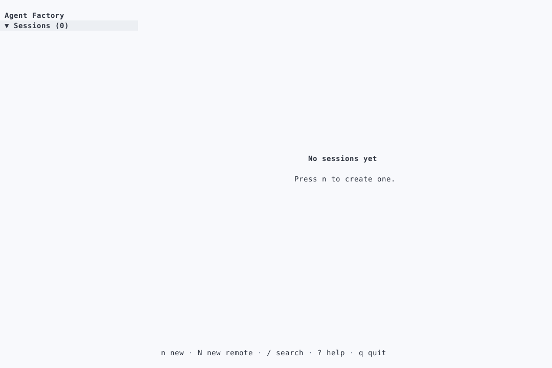
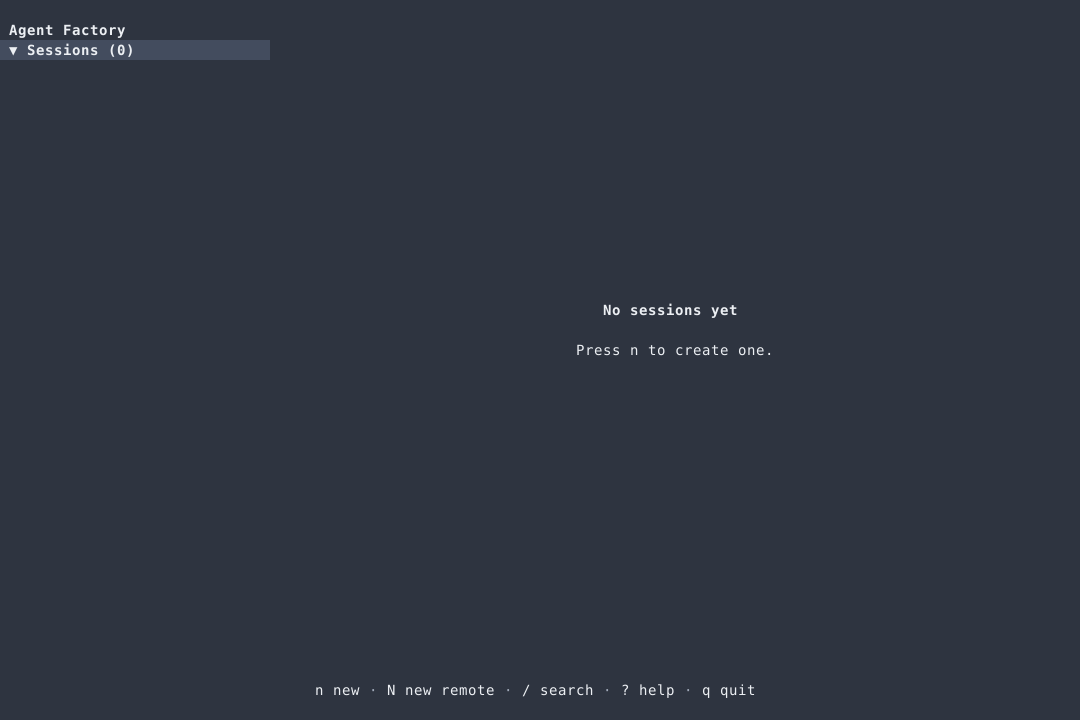
Use surface, display-sized ink for the condition and body-sized ink for the next step. Use space-4 between explanation and the single primary action. No illustration, card or extra colour. Distinguish zero sessions from no project; empty TUI sections do not reserve permanent rows.
Web · Light
No sessions yetCreate a session in todo-cli.
No project selected
Choose a project to see its sessions.
TUI · Light
No sessions yet
Press n to create a session.

No project selected
Choose a project to continue.
Web · Dark
No sessions yetCreate a session in todo-cli.
No project selected
Choose a project to see its sessions.
TUI · Dark
No sessions yet
Press n to create a session.

No project selected
Choose a project to continue.
Errors and notices
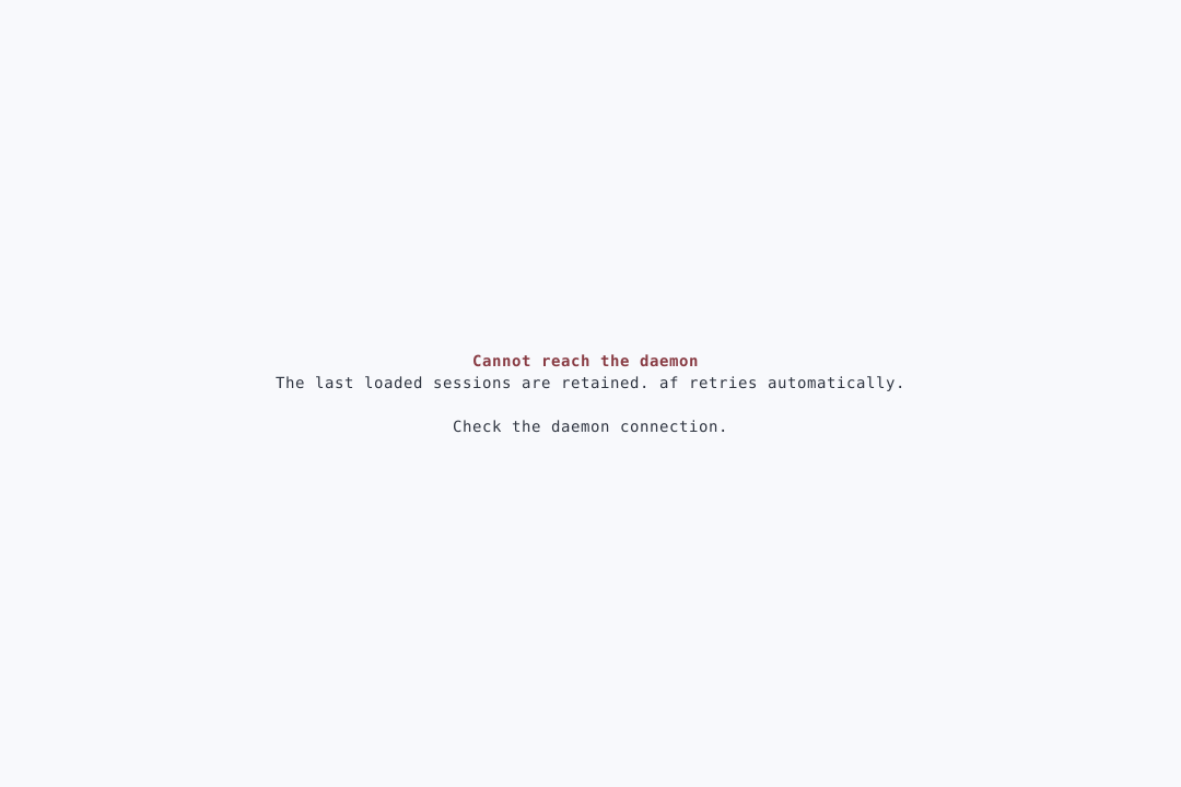
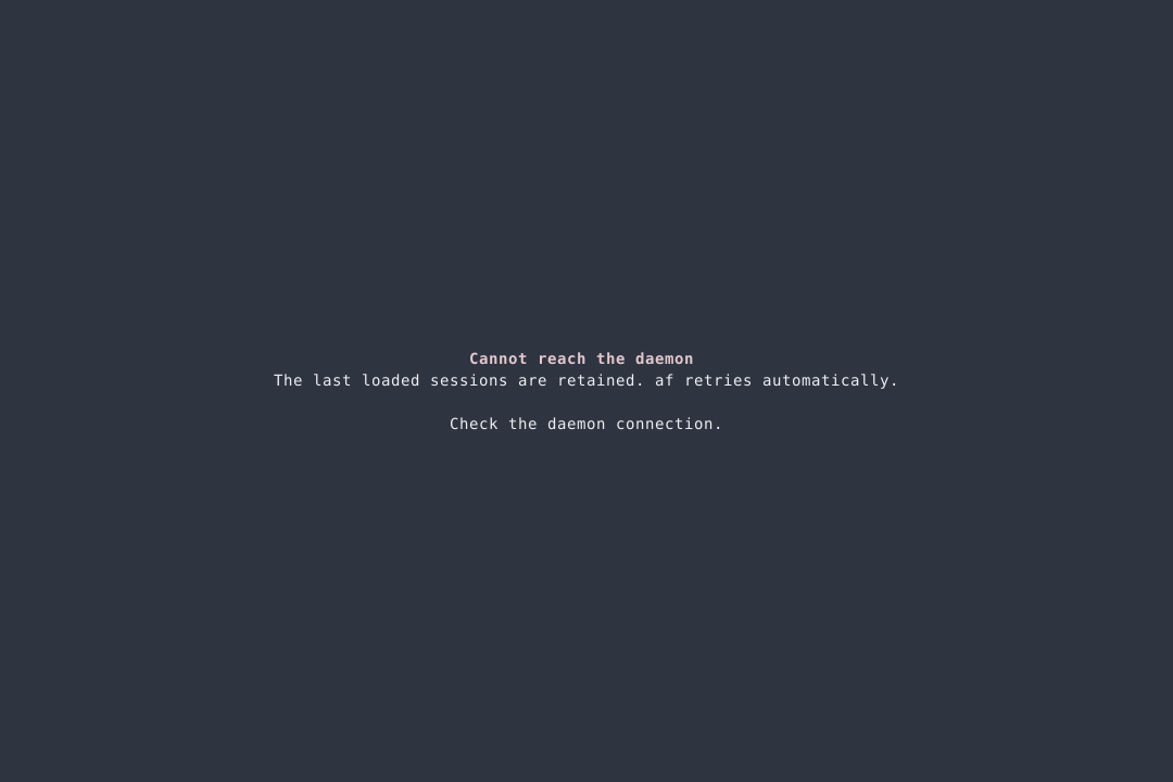
Use surface and body-sized ink for consequence and recovery instructions; only the failure heading uses dead. A full unavailable screen may use display type. Use space-2 inside the message and space-4 before the recovery action. Save/restart notices use ink, never ready green. Wrap actionable text and preserve entered input.
Web · Light
Cannot reach the daemonSessions could not be loaded. Check the daemon, then retry.
Login expired
Sign in again to reconnect.
TUI · Light
Cannot reach the daemon
Sessions could not be loaded.
Check the daemon, then retry.

Login expired · Sign in again
Web · Dark
Cannot reach the daemonSessions could not be loaded. Check the daemon, then retry.
Login expired
Sign in again to reconnect.
TUI · Dark
Cannot reach the daemon
Sessions could not be loaded.
Check the daemon, then retry.

Login expired · Sign in again
Help and status bar
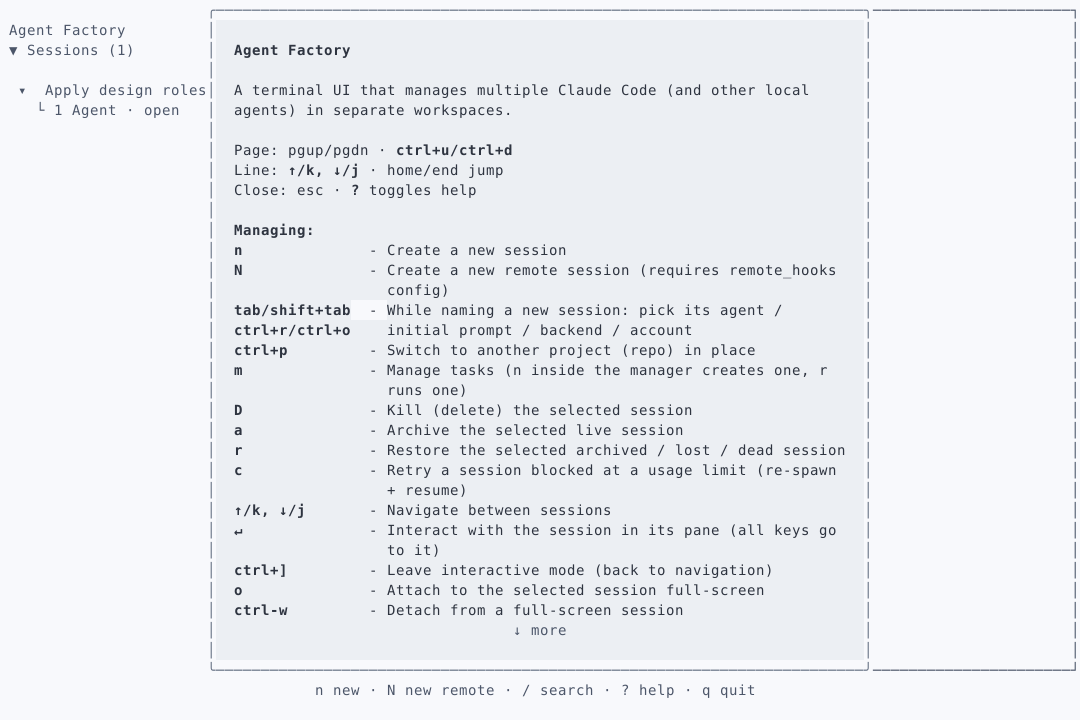
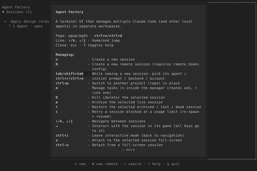
Use surface and body-sized ink for shortcuts and exit instructions; only supplemental annotations use caption-sized ink-muted. Use space-2 between fragments, no boxes or state colours. Show valid shortcuts for the current keyboard owner; the exit route survives narrow widths. Connection labels are static.
Web · Light
Connecting…
TUI · Light
ctrl+] return · ? help
Connecting…
Web · Dark
Connecting…
TUI · Dark
ctrl+] return · ? help
Connecting…
Phone layout
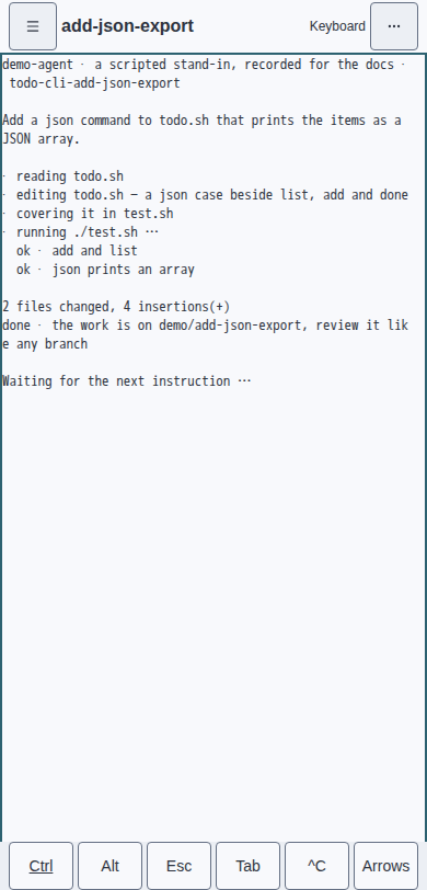
At widths up to 768px, a selected terminal is the screen. Keep this composition active while the drawer overlays it, without moving or resizing the terminal. Use one 48px top row: drawer toggle, truncating session title, static Keyboard ownership label and one … disclosure. Preserve the full title in title and aria text. The disclosure holds project choices, Sessions · Tasks · Config, install, Light · Dark · System, Disconnect, pane actions and the session tab switcher. Project choices and new-tab types are inline inside it, without nested disclosures. For a split session, show the focused pane and keep Hide pane in the menu; restore the split when returning to desktop. Escape closes the disclosure and returns focus to its trigger. The drawer, Tasks, Config and nonterminal content retain their existing phone layouts.
While a terminal owns the keyboard, show one 44px keybar above the soft keyboard, following the visual viewport and safe-area insets. Ctrl, Alt, Esc, Tab, ^C and Arrows share the row. Arrows replaces it with More keys and ← ↑ ↓ →; More keys restores the primary row. At 360px, six targets fit with 4px gaps and 8px horizontal insets. Hide the bar when ownership leaves the terminal or the viewport exceeds 768px. Refit the terminal so its last row remains above the bar.
With the soft keyboard closed, the terminal element must occupy at least 85% of the visual viewport at 360, 390 and 430px. Browser assertions enforce this in both themes. Preserve the pane padding so the inset focus border cannot paint over column one; the screen must stay inside the host with no horizontal scroll. Keep all targets at least 44px, truncate instead of wrapping, use existing tokens and static glyphs, and do not animate.
Ctrl and Alt apply once to the next key, including the bar’s own keys. IME composition is sent unchanged and leaves the modifier armed. Double tap within 350ms to lock; tap again to release. An armed modifier has the selected-row surface, bold ink and accent edge. A locked modifier also has an accent outline and static ▸ marker. Buttons retain terminal focus on pointerdown; there is no animation. ^C always interrupts, even with a modifier armed.
Implementation reference
The examples above are the specification; this compact reference is for implementers,
not a palette picker. Every value below comes from design/tokens.json. Adding a role
or step fails validation: revise a component rule before enlarging this contract.
Exact internal values · 23 tokens
| Colour role | Light | Dark | Required use |
|---|---|---|---|
| accent | #2d6271 | #2296f3 | Primary button fill, selected marker, active-tab underline and keyboard-focus outline; never liveness |
| archived | #4c566a | #d8dee9 | Archived glyph and label only; retained history |
| border | #657084 | #3d3d3d | Unfocused control and pane outlines only; never a rule around every content row |
| dead | #883b43 | #e4c8cd | Dead glyph/label and failed-operation or destructive-confirmation text; never ordinary selection |
| ink | #2e3440 | #cccccc | All body text, names, headings, field labels and action labels |
| ink-muted | #4c566a | #9d9d9d | Secondary metadata only: path, timestamp and shortcut annotation; never body text or field labels |
| limit-reached | #73436b | #dbb9d5 | Limit reached glyph and label only; no decorative purple |
| lost | #705014 | #ebcb8b | Lost glyph and label only; do not infer an error from a slow connection |
| ready | #405430 | #d5e2cc | Ready glyph and label only; green never means keyboard focus or generic success |
| running | #4c566a | #d8dee9 | Running state text only; no indicator, including in-flight operations |
| surface | #f8f9fc | #1f1f1f | Every page, rail, header and terminal chrome background; also text on the primary accent button |
| surface-raised | #eceff4 | #2b2b2b | Dialogs, menus, inputs and selected rows only; never a second page background |
| Metric | Web | TUI | Required use |
|---|---|---|---|
| radius-control | 4px | 0 | Buttons and inputs only; square terminal controls |
| radius-dialog | 8px | 1 | Dialogs and menus only; rounded terminal overlay |
| space-1 | 4px | 1 | Glyph-to-label gap; one horizontal terminal cell |
| space-2 | 8px | 1 | Related controls and row inset; one horizontal terminal cell |
| space-3 | 16px | 2 | Panel/dialog inset; two horizontal terminal cells |
| space-4 | 24px | 1 | Section separation; one vertical blank terminal row |
| type-body | 0.875rem | 1 | 14px: body, fields, buttons and session/task names; one terminal row |
| type-caption | 0.75rem | 1 | 12px: secondary metadata only; one terminal row |
| type-display | 1.5rem | 1 | 24px: zero-session or unavailable-screen heading only; one bold terminal row |
| type-heading | 1rem | 1 | 16px: section and pane headings; one bold terminal row |
| type-title | 1.25rem | 1 | 20px: dialog title; one bold terminal row |
Body and state text meet 4.5:1 on both surfaces; body ink meets 7:1 on surface.
Light control outlines meet 3:1 on both surfaces; dark outlines meet 1.5:1 on surface. Primary
buttons use accent with surface text at 4.5:1. No extra selection, on-accent, danger,
hover, shadow or preview colour exists. Selected rows use surface-raised and an accent
marker; failed-operation text reuses dead. Ink-muted is secondary metadata only.
Ink-muted must differ from ink by at least 1.5:1 luminance contrast in both themes
and remain lower-contrast than ink on both planes. A matching liveness colour needs
a per-theme sharesMuted rationale in the source; running and archived share it
intentionally in light only.
Fonts, 400/600 weight, 1.5 web line height, 44px touch height and a 2px focus ring are
fixed component rules, not more tokens. Indicators never animate. User-caused web
disclosures may take at most 120ms; reduced motion and all TUI changes are immediate.
Capture coverage
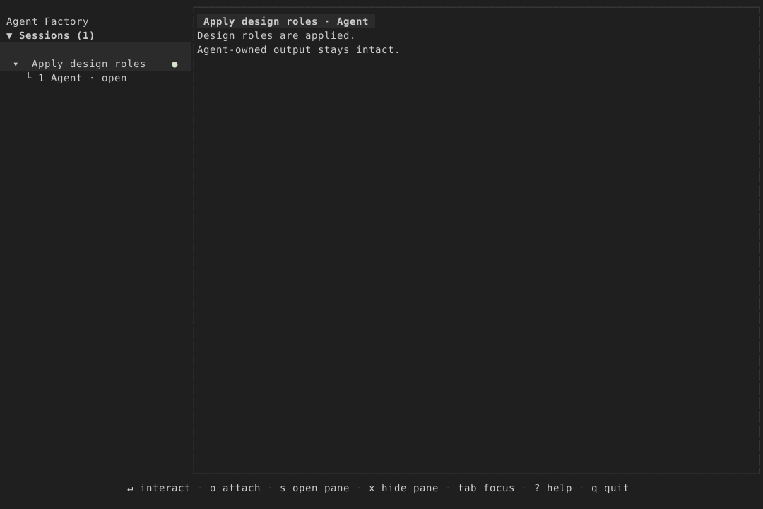
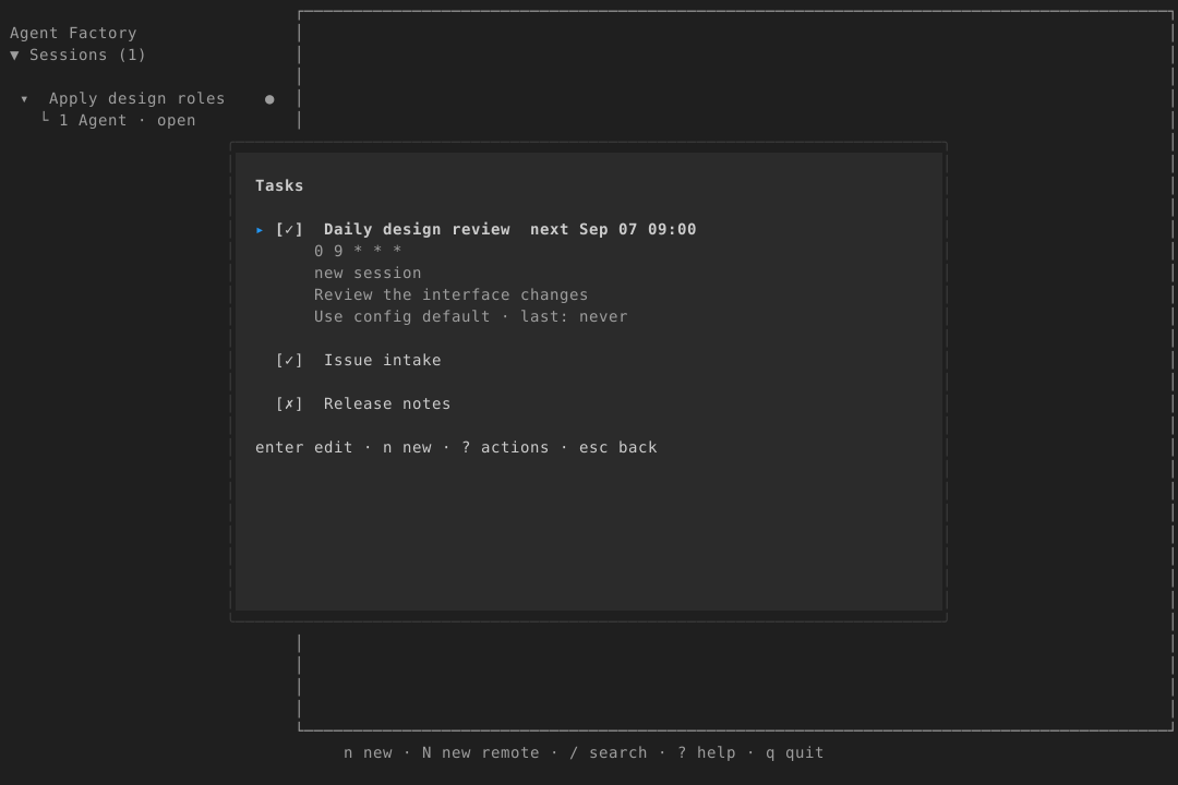
The Sessions still and Tasks still use the same refreshed app-model driver as the light/dark matrix. The TUI video uses the separate real-agent recorder. Stand-in and model fixtures are identified at their source.
Regeneration
Run make docs, then go run ./scripts/gen-design --check and mkdocs build --strict.
The docs drift gate checks the web CSS, Go theme, docs CSS copy and this page together.
Edit the token source and specimen sources, never these generated outputs.
Every web UI PR must verify a focused session at phone widths (360, 390 and 430px)
in both themes, including title truncation, overflow keyboard access and 44px
controls. Regenerate affected container goldens and keep pixel-exact checks and
performance budgets passing.
Recovery screens · P4
The recovery capture matrix shows the application’s empty, unavailable and failed-operation states in both themes. These captures come from asserted container selftest scenes; the surrounding chrome remains owned by P2.
The TUI recovery matrix contains app-model driver captures in both themes, supplemented by an isolated real tmux onboarding run.
TUI roles · P5 slice A
The TUI role gallery applies the generated roles to 96 app-model driver stills. Slice A replaces the configurable TUI palette and private ANSI colours; the common overlay recipe and density cuts follow in B, and the Light/Dark/System selector and migration in C.
The TUI overlay and density gallery applies the shared dialog frame and TUI cut list. The TUI appearance gallery shows Light / Dark / System and the retired-key migration.